
|
Collecting Criteria. |
| What do I look for in a Postcard.? | ||||
|
The first consideration I have is for a good quality Real Photograph postcard. A well focused sharp and clear photo of the subject. Secondly, an attractive and/or interesting pose with something to endear itself to me. Thirdly, ideally, condition is important. In most kind of collecting condition is 'king' Of course in the day to day practice I usually find that when I find a card I like those three considerations go 'out the window'. I am of course a straight middle aged man and the image of an attractive woman can often sent the logical part of my brain on an extended leave of absence! Sometimes the condition of a card can add to the 'romance of the hobby' within reason of course. I suppose what Im saying is, The card has to 'reach me' or one way or another make me 'feel something' though this can cause a bit of a 'stir' at a busy PC fair! |
||||
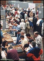 |
A typical Postcard Fair........and two hours later >>>>> |
|
||
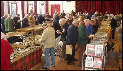 |
The crowd in a frenzy at my local postcard fair... Several people woke up and one old gent fell over when I took this picture! As from January 2011 This fair is no longer at this venue. |
|||
|
The PC's here have survived for up to 120 years. Many of course would have been collected from day one! just as stamp collecting started when the first stamps were issued.Proper PC albums were available to the more affluent collector and in this case PC condition will be good. Many other cards seem to have been kept in a shoe box, the back of a drawer, an old sock...whatever.Some appear to have been pinned to a wall as an ad hoc form of decoration whilst others for example, Calender cards were designed to be just so. Picture Postcards in there heyday were extremely popular as a cheap and reliable form of communication. Many of the cards in my collection have been posted, and therefore bear the messages written by the original posters. For me this is a bonus.Reading these everyday messages is a direct line to the past. |
||
| Scanning the Postcards | ||
|
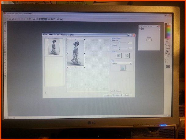
The Scanner I use is an HP Envy 4502 .As I have mentioned on another page, I dont have much available dosh for my hobby, but this little scanner seems to be quite adequate for the job.Paint shop pro is the software I use for any image proccessing needed. The Quality of the scan varies,depending on the finish, texture, colour of the postcard. The most frequent problems are with Magazine and Art Print finishes. Frustrating, but thankfully rarely enough, some postcards just seem to scan poorly, producing moire and jpeg artifacts which just wont go away. After scanning, I re-size to an appropriate size to make them easier to edit.Often I need to use a little Gamma Correction to bring the postcard back to its real brightness level. Though the only other effect I use is the sharpen effect. Usually scanning reduces the sharpness a little, and I like to 'put it back' Image heavy sites like this one, do tend to be a little slow to load on the average dial up server, so the size of the scans on the site have been kept to an average of around 500 x 800. The thumbnails themselves had to be 100x160 to make them any use as a guide to the postcard image and also not to take too long to load. Of course the well heeled amoungst us may have ISDN or Broadband. One day these will be the norm. But until they are cheap enough, patience a little is required. ( Havent had dial up for quite some years now Heh !) |
||
 |
||
|
Most recent Scan Method software 'Aquired' through
Paint Shop Pro 7 HP Envy 4502 Printer Scanner
|
||
|
Note: January 2017. Now I have Fibre Broadband. I have also removed a lot of "junk" from my website and unused sections giving me far more space to concentrate on the Theatrical Postcard side. I was over the limit of my allowance. |
|
Removing any Damage from the Postcards with Software |
||
| This is an easy one, I dont do it! For me this is not in the spirit of the hobby. Having said that, there are four postcards on this site which have been slighty altered. I added contrast to two faded postcards (one Olive May and one Thelma Raye. )so that the detail could be seen better on the site. The other two I have genuinly removed marks digitaly ( one Mabel Love bas relief card and one Mabel Green. )as I liked the cards so much I couldnt resist. The marks were on the faces of the women. There! I feel much better admiting that now... | ||